Special Group 4:
Spreadsheets
Erich Neuwirth
Vienna, Austria
|
Creative spreadsheet graphics in mathematics teaching and modeling |
|
|
Spreadsheet uses in elementary statistics course |
|
|
Why are spreadsheets so unfriendly? |
|
|
Elementary statistics with spreadsheets |
|
|
The spreadsheet paradigm as a new mathematical notation |
|
|
Spreadsheets across the curriculum |
With the exception of text processing programs spreadsheets are the most widely used software category. Using this kind of software to teach mathematics has the tremendous advantage that we are using software that is also used “outside of mathematics”, thereby connecting mathematics with other subject areas, building upon experiences and skills of our students acquired in different contexts. For secondary school students, and for college students who are not mathematics majors, this connection of mathematical knowledge with applicable skills is extremely important.
One important aspect of spreadsheets is that they are not “just very smart and big pocket calculators”, but that they offer opportunities to work with mathematical concepts in a new way. Cells are variables, since their value can be changed at any moment, and values in dependent cells will update automatically when the “independent” cell values are changed. Spreadsheet programs “encapsulate” dependencies between different variables in formulas connecting cells, and therefore allow modelling the structure of a problem with cell variables. When the model is set up, varying the cell values, i.e. the variables, gives the “general solution” to the problem modelled.
When using a spreadsheet, the emphasis is on the process and the algorithm. For many students, this dynamic and action oriented approach seems to be helpful. Despite the complexity of the problems spreadsheets can handle, they are rather easy to learn, and can even be used at the grade school level.
The presentations in this group showed the wide range of possibilities for using spreadsheets in different math curricula.
Deane Arganbright demonstrated the graphing capabilities of spreadsheet programs, constructing parameterised curves and showing how they can be animated.
Piotr Bialas investigated how a spreadsheet based elementary statistics course helped in understanding statistical concepts.
Greg Butler compiled a set of suggestions on how to improve spreadsheet programs for didactical purposes.
Kent Neuerburg presented a course curriculum for an introductory (descriptive) statistics course based on spreadsheets.
Erich Neuwirth used spreadsheets to represent mathematical concepts like recursion and iteration, using examples from combinatorics and from difference and differential equation.
Robert Smith gave an overview on the different areas in mathematics where spreadsheets can be used productively, ranging from analysis to abstract algebra.
Creative spreadsheet graphics in mathematics teaching and modeling
Deane Arganbright
Martin, USA
2. A Mathematical illustration from differential equations
3. Creating interactive graphs of functions
4. Designing innovative animated graphics
5. Exploiting the spreadsheet design: Bezier Curves
The spreadsheet is an excellent and readily available tool for teaching and learning mathematics. Mathematical models, algorithms, and visualization techniques can be implemented in spreadsheets in an interactive format in a way that the creation process itself conveys the underlying mathematics. Examples show how mathematical modeling and teaching are enhanced through innovative and animated spreadsheet graphics. Mathematical illustrations come from diverse areas of mathematics.
1 Introduction
The spreadsheet is an exceptionally effective tool for the study and teaching of mathematics and mathematical modeling. We can generally implement mathematical models and algorithms that are iterative or recursive on a spreadsheet in a natural manner. Moreover, frequently we can do this in a way that leads to the discovery of an underlying algebraic representation of the topic. The spreadsheet has two additional advantages for use in teaching mathematics. First, its operation is easy to learn and most students are familiar with the fundamentals of spreadsheet operation. Second, the spreadsheet is a tool that is readily available and widely used in the workplace, so that students are provided with skills that are highly valued in future study or employment. We use Microsoft Excel to create our examples.
2 A Mathematical illustration from differential equations
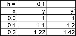
As one example of the use of a spreadsheet to investigate a mathematics topic, suppose that we wish to approximate the solution to the initial value problem y’ = x + y, y(0) = 1. In Fig. 1 we first enter the initial values at the top of the first two columns and then compute the corresponding value of y’ as the sum of x and y. We next increment the value of x by a chosen step-size, h. As the key step we then approximate the corresponding new value of y by increasing the previous value of y by the product of the rate of change and the step-size. Once we have entered this formula, we can then copy the bottom expression in each column to extend the model for any number of rows. Our initial output appears in Fig. 2.
|
|
|
|
Fig. 1 |
Fig. 2 |
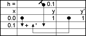
The traditional way to display spreadsheet formulas is via their cell locations. However, this is usually not the way in which we actually create the formulas. Instead, we typically create formulas by “gesturing”, or by clicking on the appropriate cells in the display, rather than typing in cell locations. Fig. 1 illustrates notation that was developed by Erich Neuwirth (see Neuwirth and Arganbright). Thus, we first select the cell for the new value of y and enter = to create a formula. We then click on the cell above to give the previous y-value (y), type in the plus sign, click on the cell above and to the right for the rate of change (y’), type in *, and then click on the step-size cell (h). Because we will want to copy this expression, we need to insure that the reference to h is absolute. In the notation of Fig. 1 the “pin” in the reference to h indicates an absolute reference that will remain fixed in copying.
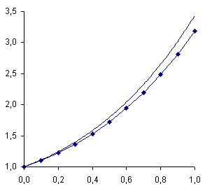
In this process we have used only basic concepts to create our model without referring to any formal notation or to cell location labels. In the process we have developed an algorithm called Euler’s Method. We can use our construction to write the algorithm in standard mathematical notation as x1 = x0 + h, y1 = y0 + y’0 h. Students also can solve the problem analytically and compare the actual solution to the approximation and then use the spreadsheet model to study the effects of changing the step-size, h. They can also implement various modifications of Euler’s Method. Creating a spreadsheet graph comparing the approximation and the actual solution, as in Fig. 3, enhances such an investigation.
|
|
|
|
|
|
Fig. 3 |
|
3 Creating interactive graphs of functions
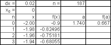
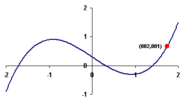
Mathematical graphs of real valued functions are created in a spreadsheet through the xy-graph type which plots a sequence of computed (x,y)-coordinates and connects successive points by line segments. In the first column of the model of Fig. 4 we number points from n = 0 to n = 200 in the first column, compute x-values in steps of dx = 0.02 in the second column, and enter a formula to calculate y-values for the function f(x) = 0.4x3‑x + 0.3 in the third column. We then create an xy-graph from the second and third columns. We next produce values for one particular point (a, f(a)) and drag it into the chart to produce another graph series. We also use string functions to create an expression for the point’s coordinates and attach it as a label to the point.
|
|
|
|
|
|
Fig. 4 |
|
The resulting graph is shown in Fig. 5. Now there are several ways to use our model. If we manually enter the value for a and the formula for f(a), then we can use the spreadsheet’s Solver command to find a local minimum, local maximum, or zero of f(x) by varying the value of the cell containing a. Alternatively, instead of entering the value of a directly, we can enter a value for a counter, n, 0 £ n £ 200, and use lookup functions to find the values for a and f(a) for point n. We then attach a scroll bar to the cell containing the value of n, and as we move the scroll bar’s slider the value of n changes and the point moves along the curve. With a little more ingenuity we can also draw a tangent line segment that moves along with the point. These techniques allow us to animate an investigation of the nature of the function.
4 Designing innovative animated graphics
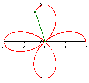
Next, we focus on some even more creative graphic applications in mathematics. For example, we can create the graph of a polar equation r = f(t) by generating values for t and r in n steps of one degree, 0 £ n £ 360, and convert these into the (x, y)-coordinates of an xy-graph as x = rcos(t) and y = rsin(t). Moreover, we can greatly enhance our graphs by using animation to show how such a curve is traced out. We use the =if function to generate a second column of y-values, reproducing only those values up through n = N for a given integer N. We then link N to a user-designed scroll bar that varies from 0 to 360. As we move the scroll bar, the curve will be traced out in a continuous fashion. We can also include construction lines that are updated as the spreadsheet changes. Fig. 6 illustrates the development of the curve r = a + b sin(ct), with a = 0 and b = c = 2. The model incorporates cells for the parameter values a, b, and c.
|
|
|
|
Fig. 6 |
Fig. 7 |
Our technique also allows us to create animated illustrations of the construction of various geometric objects. Fig. 7 shows the construction of a pedal curve for a deltoid (Arganbright 1993). We create a pedal by finding the intersection of a tangent to a moving point on the original curve and a line from a fixed point (here (-1,0)) normal to the tangent. The points of intersection trace the pedal curve. This same approach can be used to illustrate the creation of conics from their definitions. We can also pique student interest by using geometry with a spreadsheet to generate a wide variety of cultural patterns, tessellations, and other artistic images.
For use in teaching, the primary emphasis undoubtedly should lie in having students create both the models and the graphs themselves. The actual act of creating these tends to reinforce the ideas being studied. However, spreadsheets can also be used to create instructor-designed models for classroom demonstrations. In fact, we can create most examples and illustrations found in texts as interactive and animated models on a spreadsheet. Finally, a class can incorporate projects in which students design more advanced graphic models themselves.
The graphs in Fig.s 8 and 9 provide two illustrations of demonstration or project models. In Fig. 8 a spreadsheet chart provides the direction field of an ordinary differential equation, showing points and direction vectors at lattice points that can be varied by a user. In addition, we can include the solution of a specific differential equation, where the coordinates of the initial condition are entered in parameter cells and used to determine the solution function. By linking the initial y-value to a scroll bar, students can see the effects on the resulting function as the initial condition changes and how these fit the direction vectors.
|
|
|
|
Fig. 8 |
Fig. 9 |
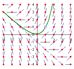
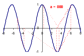
Fig. 9 is a graphic illustration of Newton’s Method. It is particularly effective for illustrating the sensitivity of the algorithm to the choice of the initial estimation for a zero. Newton’s Method itself is extremely easy to implement on a spreadsheet. In the illustration for finding zeroes of f(x) = cos(x), we enter an initial estimate of x0 = a, and the graph shows the tangent lines drawn to obtain successive approximations. With a = 0.30, the algorithm locates an unexpected zero. After some vacillation it converges to x = ‑3p/2. If we change x0 slightly, to say a = 0.29 or a = 0.31, the algorithm converges to markedly different zeroes. By linking the value of a to a scroll bar, or by using a button to show the steps of the algorithm, we create an effective teaching device for use in classroom discussions.
There are many similar topics that can be enhanced effectively using spreadsheet graphics. In 2-dimensional linear algebra these include eigenvectors, the solution of systems, and the exploration of various bases. In numerical analysis we can illustrate interpolation, zero-location, integration, and similar topics. In operations research, 2-dimensional linear programming and a whole range of network algorithms can be implemented and visualized through interactive diagrams. In computer science we can construct models of data structures and concepts of computer graphics. A particularly nice example is morphing, where we use linear algebra to continuously change one curve (butterfly) into another (rabbit).
Applications, even those previously considered rather advanced, often are quite accessible. A geometric growth model is easily modified into a logistic growth model through a difference equation. Difference equations also can used to study the spread of epidemics and predator-prey models in which a graphic phase state display is used to interrogate the model. Many physical models, such as heat flow, are also naturally done on a spreadsheet and allow us to use three-dimensional graphics. Finally, a whole range of statistics examples can be implemented in an interactive and animated visual fashion.
5 Exploiting the spreadsheet design: Bezier Curves
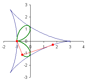
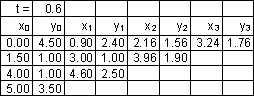
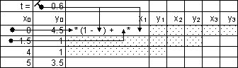
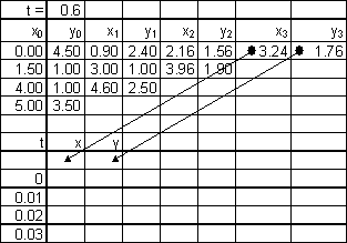
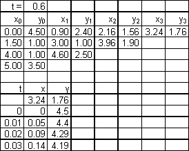
We now provide an additional example to show how a spreadsheet allows us to explore an important idea that arises from a simple description, and then illustrate it graphically. Bezier curves are used in computer graphics and product design to create smooth curves. To create such a curve, we start with n control points. In Fig. 10 we use four control points, P0, P1, P2, and P3. On the line segments joining pairs of points we determine the points that are a certain fraction, 0 £ t £ 1, between these. We show the case t = 0.6. These points can be found as (1‑t)(x0, y0) + t(x1, y1). We then repeat the process over and over using the resulting points, until eventually we arrive at a point, f(t), which lies on the Bezier curve determined by the Pi.
|
|
|
|
|
|
Fig. 10 |
|
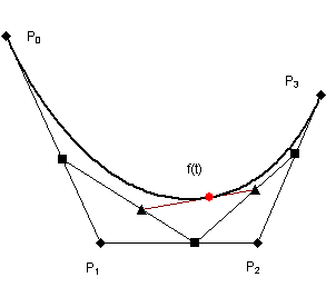
We carry out this scheme in a spreadsheet by computing the first intermediate x-value as shown in Fig.s 11 and 12. Notice that the same formula applies throughout the table for each x- and y-value. Hence, we only need to copy the first formula as indicated by the shading. The (x, y)-coordinates of the point on the Bezier curve are generated at the upper right.
|
|
|
|
Fig. 11 |
Fig. 12 |
To form the resulting curve, we use the spreadsheet’s Data Table tool to generate the (x, y)-values for successive values of t. To use the Data Table feature, we create a column of t-values down one column, initially leaving a blank row at the top of the table. We use the next two columns to generate x- and y-values. To do this we use formulas to reproduce the x- and y-values from our computation for a particular value of t as presented in Fig. 13. We then issue the Data Table command entering the option to let the cell for the parameter t at the top be the column input cell. The spreadsheet then repeatedly enters value of t from the first column in this cell and places the corresponding (x, y)-values in adjacent cells as shown in Fig. 14. We form the resulting curve by dragging these columns into the graph to produce Fig. 10. After the curve is created we can embellish our display by including the point for f(t) attached to a slider, or move the initial control points either manually within the spreadsheet or by using the mouse to drag these points in the graph itself.
|
|
|
|
Fig. 13 |
Fig. 14 |
6 Conclusion
The illustrations and techniques described in this paper can be used in a variety of ways in teaching. First, since most students have access to spreadsheets, assignments can be made in virtually any mathematics class. Another approach is to design a spreadsheet modeling class. This is being done as an experimental upper-level course at the University of Tennessee at Martin. A similar class also could be designed as an introductory first year course for students who need to know how to use mathematics, but not necessarily algebra.
References
Arganbright, D. (1993) Practical Handbook of Spreadsheet Curves and Geometric Constructions. CRC Press.
Neuwirth, E. and Arganbright D. Spreadsheet Programs as Tools for Mathematical Modeling, in preparation.
Spreadsheet uses in elementary statistics course
Piotr Bialas
New York, USA
Many important statistical concepts that seem too obscure for the beginning student can be readily understood through visualization and the ability to perform complex computation rapidly. The presenter will share the results of his investigation about the effects of the spreadsheet on achievement in selected statistical topics of undergraduate students in an elementary statistics course.
1 Introduction
Knowledge of statistics is becoming increasingly necessary as we are called upon to make decisions based upon incomplete or uncertain data (Jacobsen 1989). In schools, statistics are becoming more important in the physical, biological and social sciences. As computational skills decrease in importance owing to the wider use of calculators and microcomputers, more attention can be given to the application of mathematics to real-life problems, which require students to collect and analyze their own data.
The teaching of introductory statistics is a topic which generates many long and frequently heated discussions (Jolliffe, 1976). Two main problems from the teacher’s viewpoint are that many students lack fundamental mathematical skills, and to some extent linked with this, they lack motivation to learn statistics. The lower students’ mathematical ability the less likely they are to be motivated to study statistics (see Kalton, 1973).
2 The main study
The purpose of the study was to investigate the effects of the spreadsheet on achievement in selected statistical topics and the effects on beliefs about statistics of undergraduate students in an elementary statistics course.
The study sought answers to the following questions:
 Does the use of the spreadsheet affect students’
achievement on every topic selected for the study?
Does the use of the spreadsheet affect students’
achievement on every topic selected for the study?
Is the level of previous computer experience of
students related to their achievement on the topics selected for the study?
Does the use of the spreadsheet affect students’
beliefs about statistics?
Does students’ achievement on the topics taught
with the spreadsheet approach differ from achievement on the topics taught
without the spreadsheet?
The investigator conducted the experiment with students in one class at the beginning of the fall 1999 academic semester in a community college setting. The registered students were pre-tested earlier; the results of the Departmental Mathematics Proficiency Test were used in order to evaluate their academic ability level. At the beginning of the semester each student obtained two questionnaires designed to determine his or her computer experience and to evaluate beliefs about statistics. The second questionnaire related to students’ beliefs was administered again at the end of the semester.
The investigator selected and taught eight Elementary Statistics course topics. The selected topics, divided into two groups of four topics, were taught using a traditional method of instruction and the spreadsheet approach.
During class sessions, students used computer labs and the spreadsheet program, Excel 5 and/or Excel 98. The instructor developed the curricular units and the posttest instruments. A jury evaluated the test instruments with respect to content validity. At the end of each topic students were tested on their newly acquired statistical knowledge.
3 Results of the study
Research question 1:
Does the use of the spreadsheet affect students’ achievement on every topic selected for the study?
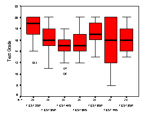
The results of the repeated measures Anova indicate a statistically significant Student Achievement on Tests effect with F1, 24= 22.37 and p = 0.0001 (see Fig. 1).
Research question 2:
Is the level of previous computer experience of students’ related to their achievement on the topics selected for the study?
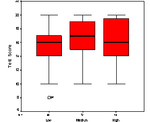
A one-way Anova was conducted with the factor being Student Achievement and the dependent variable being the Test Score on tests during the study. The results for the Anova indicated statistically significant Student Achievement effect with F2,197 = 4.649 and p = 0.011 (see Fig. 2).
Does the use of the spreadsheet affect students’ beliefs about statistics?
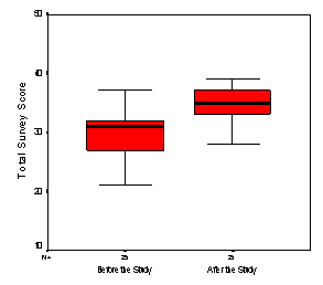
A Paired Samples t-test was statistically significant, t = 6.983 and p < 0.001, indicating that the survey’s results were not the same after its administration at the end of the course. The t-test for the paired samples indicated a shift in opinion of students with respect to survey questions (see Fig. 3).
Research question 4:
Does students’ achievement on the topics taught with the spreadsheet differ from achievement on topics taught without the spreadsheet?
A one-way repeated-measures Anova univariate-approach procedure was conducted with the factor being Student Achievement and the dependent variable being the Total Test Score.
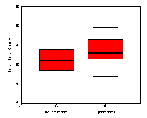
The results for the Anova indicated a significant Student Achievement effect, F1, 24 = 22.4504 and p < 0.0001 (see Fig. 4).
The data indicate that the tests scores obtained after testing topics taught with the spreadsheet approach were different from the test scores obtained after testing topics taught without the spreadsheet approach.
|
|
|
|
Fig. 1: Distribution of test grades for test 2 through test 8 |
Fig. 2: Distribution of test scores by computer experience |
|
|
|
|
Fig. 3: Distributions of total survey scores for ‘before the study’ and ‘after the study’ |
Fig. 4: Distribution of the total tests scores for ‘No Spreadsheet’ and ‘Spreadsheet’ teaching approach |
4 Conclusions
Test gains show that the
spreadsheet approach to instruction was positively related to student achievement
on every topic selected for the study. In addition, students’ achievement on
tests of topics taught with the spreadsheet was greater than their achievement
on tests of topics taught with no spreadsheet.
Student achievement was not the same for students with low prior
computer experience. Students with low computer experience obtained lower
grades on tests when compared with students with medium computer experience
and students with high computer experience.
The use of the spreadsheet files seemed to affect students’ beliefs
about statistics. The analysis of students’ responses to the statements on the
questionnaire indicated that students were more in agreement with the
questionnaire’s statements after its second administration at the end of
the study than they were after the first administration of the questionnaire.
The students’ comments on various class session gave some indication
that the material got harder as the spreadsheet approach progressed and that
the presentation of the topics was too hurried. It was the investigator’s
observation that some students were experiencing difficulty with the laboratory
format of instruction. For example, it was difficult for them to stay focused
on the topic and be able to follow up the navigation of different menus within
the spreadsheet software. The problem may have been due simply to their lack of
experience with the spreadsheet program rather than the laboratory format of
the sessions.
Many students commented that it was worth the effort for them to
learn about the spreadsheets. Some students expressed their predictions about
possible usefulness of the spreadsheet in their future college classes
(computing, accounting, and other-business-related majors).
This study confirmed the notion that computer-based instruction
appears to help students’ understanding of basic statistical concepts in many
ways. For example, the investigator observed that use of computer-based
technology (spreadsheet files) can transfer students’ intellectual efforts from
constructing graphical displays and tedious calculations to activities that
require higher-level cognitive skills. And that this in turn allows students to
focus on applying statistical ideas and methods and monitoring statistical
processes (Zvi and Friendlander 1997).
References
Ben-Zvi, D., Friedlander, A. (1997) Statistical Investigations with Spreadsheets. Weizman Institute of Science, Rehovot, Israel.
Bialas, P., J. (2001) Spreadsheet use in an Elementary Statistics Course. Doctoral dissertation, Teachers College, Columbia University, New York.
Jacobsen, E. (1989) Why in the World Should we Teach Statistics? Studies in Mathematics Education, Volume 77-15. UNESCO Paris.
Jolliffe, F. R. (1976) A Continuous Assessment Scheme for Statistics Courses for Social Scientists. International Journal of Mathematics and Technology, n7, 97-103.
Kalton, G. (1973) Problems and Possibilities with Teaching Introductory Statistics to Social Scientists. International Journal of Mathematics and Technology, n4, 7-16.
Why are spreadsheets so unfriendly?
Douglas Butler
Peterborough, UK
1. All angles have to be in radians
2. Slider bars only operate in positive integers in the range 0 – 30 000
3. x-y - graphing is very poor
4. The moving point average is plotted wrongly
5. The useful RANDBETWEEN() keyword is not available by default
6. Circular references are useful but can be difficult to use
7. There are all sorts of font problems with Excel
8. Shown are up to 30 decimal places, even if calculations are only to 15
9. The algorithm for trig function is poor
10. New bugs have been introduced into Excel 2000
11. Excel is not very clever at pasting data
12. You cannot name cells using ‘r’ or ‘c’
The words Microsoft and education usually appear together on exhibition stands. So why is it that their spreadsheet excel is so unfriendly to schoolchildren? Excel is used in schools extensively throughout the world, and yet its authors appear to give little heed to the needs of the youngsters who are using it. This presentation will list some of the features that give the spreadsheet such a poor feel in the classroom and invite the conference to make appropriate representations to Microsoft.
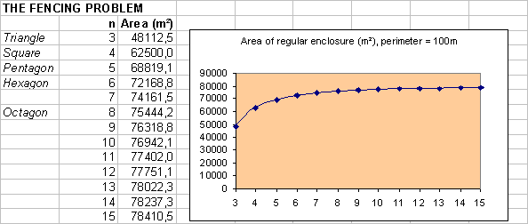
1 All angles have to be in radians
This is a serious problem for young students who are not ready for the difficult concept of radians. It would be a simple matter to put in an angle units option to the “Format” => “cells” dialog box. In this example, a common exercise for Y-10 students in the UK, a simple model looks at the area of a regular enclosure from a fixed length of fencing. The formula involves the use of tangens.
2 Slider bars only operate in positive integers in the range 0 – 30 000
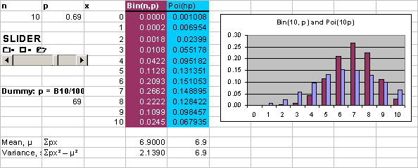
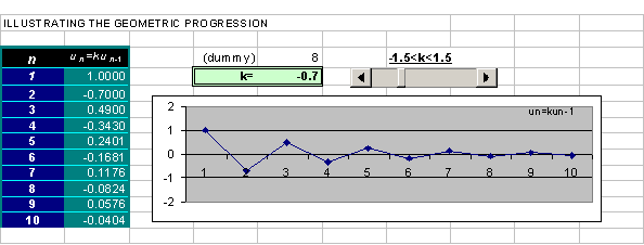
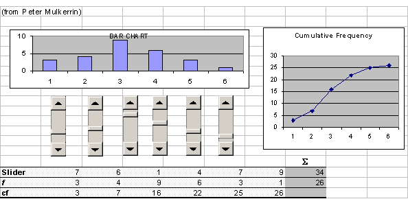
Again, sloppy programming makes this restriction very tiresome for users. Experience teachers may enjoy the added problem of designing a linear transformation using a dummy variable, but the students could do without it! They are a vital tool in turning the spreadsheet into a dynamic environment for mathematics:
A
slider bar is used to show the comparison between the Binomial Poisson
A geometric progression with variable ratio
A dynamic bar chart and cumulative frequency
diagram
Note: double-click on any of the spreadsheets to wake them up, to operate the sliders, etc.
|
|
Fig. 2 |
|
|
|
Fig. 3 |
|
|
|
Fig. 4 |
|
3 x-y - graphing is very poor
The only way to create a satisfactory x-y graph is to use a joined-up scatter diagram:
histograms are useless. Don’t touch them! Use
software that draws them properly (e.g. Autograph)
Making the “bin” values the right end of the
classes is odd as the left end of the first class is therefore never specified.
Who ever thought to ask users to press SHIFT-CTRL-ENTER to work out frequencies
must be out of his mind (perhaps he’s the same person that invented CAPS LOCK!)
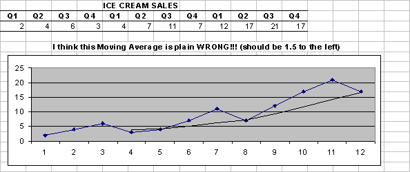
4 The moving point average is plotted wrongly
This is a serious error, unless the USA have a different way of working this out
|
|
Fig. 5 |
|
5 The useful RANDBETWEEN() keyword is not available by default
Users have to go to “Tools” => “Addins” => tick “Analysis Toolpack”. “=RANDBETWEEN (1,6)” is so much more friendly than “=INT(6*RAND())+1”, but is denied to most users
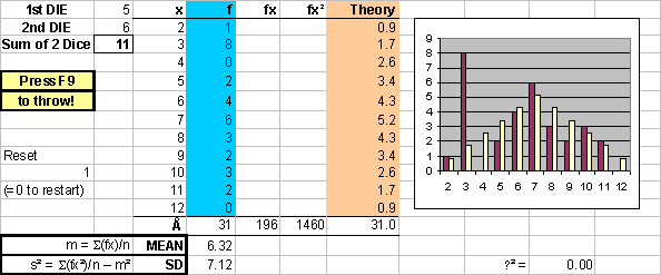
6 Circular references are useful but can be difficult to use
There is over-use of the same feature here. Circular references are very useful without having to dive into “Tools” => “Options” => “Calculation” => “Iteration” and fiddle with the number of iterations used. 100 iterations is OK, e.g. to solve x = COS(x), but the same device is used when adding a cell to itself, e.g. in counting up frequencies in a 2-dice simulation:
|
|
Fig. 6 |
|
7 There are all sorts of font problems with Excel
A class width of 1 - 10 insists on showing up as
1st
October!
Unicode fonts have to be copied from Word, and do
not work in a SS embedded in Word (there are several problems in this regard
with the SS examples in this paper)
Excel does not display
superscript/subscript copied from Word
Excel does not use the ‘proper’ minus sign, e.g.
–2
8 Shown are up to 30 decimal places, even if calculations are only to 15
This is outrageous. I would not like any of my students to think that π to 30 decimal places is
|
|
|
|
9 The algorithm for trig function is poor
|
|
E.g. SIN(PI()) = 1.22515E-16 |
|
10 New bugs have been introduced into Excel 2000
E.g. 2 non-adjacent rows do not plot correctly in a scatter diagram.
11 Excel is not very clever at pasting data
E.g. 2 non-adjacent columns copy out with the
intervening columns included.
E.g. often a data set pasted from the Internet is
place all in the first column, even if it is all nicely comma separated (users
have to do to “Data” => “Text to Columns”).
12 You cannot name cells using ‘r’ or ‘c’
These are reserved for row and column references. Users are therefore denied the letter ‘r’ (often used in stats, correlation etc, or polar values) and ‘c’ (y =- mx + c, etc)
13 Conclusion
I have a similar list for Word – both Excel and Word are almost very useful tools for mathematics (and science). Maybe we could persuade Microsoft to spend less of their energy on cosmetic refinements (that make their software not backwards compatible) and more on making the mathematical interface more friendly.
References
All these examples can be found on http://www.autograph-maths.com/downloads/
Elementary statistics with spreadsheets
Kent M. Neuerburg
Hammond, USA
3. Spreadsheets vs. statistical packages
Spreadsheets are ideally suited for use in an introductory statistics course. These programs have the ability to handle large amounts of data and are easy to use. As an added benefit, a working knowledge of spreadsheets is a marketable skill. We focus on the pedagogical and computational strengths and weaknesses of spreadsheets as well as some resources for educational applications and data sets.
1 Introduction
The advent of modern personal computers can have a dramatic impact on the way in which we teach elementary Statistics. Integrating software into the teaching of Statistics is significant in that the use of the computer shifts the students’ focus from the computation to the analysis of the data and the interpretation of the results.
For the typical introductory course in Statistics, spreadsheets can be a vital tool. Of course, for the instructor there are some immediate questions that come to mind. How can one use spreadsheets to teach Statistics? How do spreadsheets compare with specialized statistics packages? Where can one obtain information and data sets for spreadsheets? These questions are addressed in each of the following sections.
2 Pedagogy
Why use spreadsheets to teach Statistics? According to the Mathematical Association of America’s Committee on the Undergraduate Program in Mathematics (CUPM 2001):
“Students now may need experience with powerful mathematics software tools not only to promote learning in mathematics, but also to be prepared for a wide range of software tools they will encounter later on.”
Student experience with software is a vital part of their mathematical training. This experience is necessary not only for the added dimension it brings to the mathematics, but also because these same students will be working with a wide variety of software in their future careers. The more we can do to prepare them for that, the better. But, what specifically does the computer bring to the Statistics classroom? The Mathematical Association of America, in Leen (1992), states the following:
“Statistical concepts are best learned in the context of real data sets. Fortunately, using the computer to automate calculations and graphics makes it possible to work with real data without becoming a slave to the mechanics.”
The use of spreadsheets in a Statistics course meets the spirit of each of the above statements. If our goal in teaching Statistics is to prepare students to be competent users of statistics and to help them to develop a certain amount of statistical understanding, then spreadsheets are valuable tools in reaching both of these goals. Spreadsheets are pedagogically valuable because the benefits offered by their use are many--spreadsheets are instructive, interactive, and ubiquitous.
By “instructive,” we mean that in a spreadsheet one can work each step of a computation to see how the formula comes together. For example, suppose we are computing the mean of data presented in a frequency distribution. Create the following spreadsheet.
|
A |
B |
C |
D |
E |
F |
G |
|
1 |
Xm |
F |
Xm*f |
Xm^2*f |
|
Mean |
=C8/B8 |
|
2 |
15 |
36 |
=A2*B2 |
=A2^2*B2 |
|
|
|
|
3 |
25 |
45 |
=A3*B3 |
=A3^2*B3 |
|
St. Dev. |
=SQRT((D8-C8^2/B8)/(B8-1)) |
|
4 |
35 |
68 |
=A4*B4 |
=A4^2*B4 |
|
|
|
|
5 |
45 |
51 |
=A5*B5 |
=A5^2*B5 |
|
|
|
|
6 |
55 |
39 |
=A6*B6 |
=A6^2*B6 |
|
|
|
|
7 |
65 |
22 |
=A7*B7 |
=A7^2*B7 |
|
|
|
|
8 |
Sums |
=SUM(B2:B7) |
=SUM(C2:C7) |
=SUM(D2:D7) |
|
|
|
Entering the above data and formulae would result in the following output.
|
|
A |
B |
C |
D |
E |
F |
G |
|
1 |
Xm |
F |
Xm*f |
Xm^2*f |
|
Mean |
37.9885057 |
|
2 |
15 |
36 |
540 |
8100 |
|
|
|
|
3 |
25 |
45 |
1125 |
28125 |
|
St. Dev. |
14.8153981 |
|
4 |
35 |
68 |
2380 |
83300 |
|
|
|
|
5 |
45 |
51 |
2295 |
103275 |
|
|
|
|
6 |
55 |
39 |
2145 |
117975 |
|
|
|
|
7 |
65 |
22 |
1430 |
92950 |
|
|
|
|
8 |
Sums |
261 |
9915 |
433725 |
|
|
|
Most importantly, the spreadsheet need not be used as a “black box” into which one inputs the data and the desired statistic is produced. Rather, one can observe and direct the entire process as we did in the example above. The spreadsheet allows the student to visually and to physically manipulate the cells, to create the formula, and to see how the various parts of the formula come together. Neuwirth explores this manipulative nature of spreadsheets more deeply in Neuwirth (1995).
The second benefit of utilizing spreadsheets is that they are interactive. Since the calculations in a spreadsheet are automatically updated, one may easily change a single data point and observe the result on the calculated statistic. Put more simply, spreadsheets were designed for experimentation. A spreadsheet allows the student the opportunity to experiment and interact with the data. A simple example is to note the effect of a linear transformation on various descriptive statistics: What happens to the mean of a data set if all of the data values are increased by five? What happens to the mean if the data values are each multiplied by three? What happens to the standard deviation?
Certain statistical concepts can be easily explored using the interactive nature of a spreadsheet. Consider the relationship between the sample size, the confidence level, and the standard error of the mean in determining a confidence interval. Each of these values effects the size of the confidence interval. To have the students investigate the relationships between these statistics, they could create the following spreadsheet.
|
|
A |
B |
C |
D |
E |
F |
G |
|
1 |
Sample mean |
45 |
|
|
|
|
|
|
2 |
|
|
|
|
|
|
|
|
3 |
Standard deviation |
3.5 |
|
|
|
|
|
|
4 |
Sample Size |
50 |
|
|
|
|
|
|
5 |
Confidence level |
0.95 |
|
|
|
|
|
|
6 |
|
|
|
|
|
|
|
|
7 |
Standard Error |
0.49497 |
|
|
|
|
|
|
8 |
Confidence coefficient |
1.95996 |
|
|
|
|
|
|
9 |
|
|
|
|
|
|
|
|
10 |
Confidence interval |
44.0299 |
< µ < |
45.9701 |
|
|
|
|
11 |
|
|
|
|
|
|
|
By altering the values in cells B3, B4, and B5 one at a time, the students can observe the effect of the change on the values computed in cells B7, B8, B10, and D10. For example, the students can discover for themselves that a larger sample size will decrease the width of the confidence interval while a higher confidence level will increase the width of the confidence interval.
Other examples of the interactive nature of spreadsheets include the ability to run simulations with the random number generator and linked graphics. Using the random number generator the students can create simulations of probability experiments. In this way, they can quickly and easily model an experiment with 200, 300, 1000, or more trials. Moreover, with a single click they can re-run the simulation to generate an entirely new data set. Also, in most spreadsheets, the graphics are linked to the data. Changing a data value will automatically create a corresponding change in the graph. Again, this feature allows the student the opportunity to experiment. For example, how does changing data values affect the regression line?
As a final benefit, we observe that spreadsheets are ubiquitous. Spreadsheets are reasonably inexpensive (for software) and as such are readily available on most campuses. For example, at the author’s university, a spreadsheet is part of the standard software package installed on every desktop computer on campus. This availability makes it easy for a student to access a spreadsheet. On the other hand, at this same institution, the specialized statistical packages are installed on a limited number of machines residing in a dedicated mathematics computer lab. Besides the obvious convenience for the student, there is also the fact that spreadsheets are equally prevalent in the workplace. By using a spreadsheet to help learn Statistics, students are also receiving the secondary benefit of having a working knowledge of a standard piece of office software. This advantage should not be casually discounted, as such knowledge is certainly a marketable skill.
No conversation about a teaching method is complete without a discussion of the weaknesses associated with that strategy. Most of the problems encountered when attempting to teach Statistics with spreadsheets can be categorized into two types: experiential or mathematical. The mathematical problems will be addressed in the next section.
The experiential problems encountered by the author have arisen when students were unfamiliar or uncomfortable with computers. While such students are becoming increasingly rare with each passing year, there still remains a cadre of students who have little or no computer experience. The author has found that a well-designed introduction to the operating system and software (see, for example Berk and Carey 2000, Chapter One) together with ample computer time for experimentation early in the course can offer significant assistance in overcoming these problems. Even students with no prior computer knowledge can quickly master the elementary operations of opening files, saving files, entering data and formulae, etc.
3 Spreadsheets vs. statistical packages
In the last section some of the non-mathematical problems associated with teaching using spreadsheets were addressed. Now, consider the mathematical issues. Most mathematical problems arise because spreadsheets, as statistical tools, are limited. A spreadsheet is not a full-featured statistical package like SPSS, SAS, Minitab, etc. In fact, Berk and Carey (2000), recommend the following caveat.
“Using Excel for anything other than an introductory Statistics course would probably not be appropriate due to its limitations. For example, Excel can easily perform balanced two-way analysis of vari-ance, but not unbalanced two-way analysis of variance. Spreadsheets are also limited in handling data with missing values.”
One finds that most, if not all, of the functions required for the standard introductory course in Statistics are included in most spreadsheet packages. For example, functions to handle descriptive statistics (distribution statistics, histograms and other graphical representations), basic probability distributions (normal, students-t, binomial, geometric, Poisson, F, c2 distributions), inferential statistics (confidence intervals and hypothesis testing), regression and correlation, analysis of variance, etc. are usually standard. Since this course may be the first and only Statistics class many students see, spreadsheets can prove to be quite appropriate in their scope.
Naturally, if one were teaching a more advanced course in data analysis one would want to choose a complete statistics software package. There are some elementary topics such as box plots, stem and leaf plots, and dot plots that are more easily handled by the specialized packages. Additionally, plotting standard distributions (normal, Bernoulli, Poisson, etc.) is certainly easier in a specialized statistics package. Of course, more advanced topics like analysis of multi-factor experiments and non-parametric statistical methods are best treated with a specialized statistics package (see for example McKenzie e.a. 1996).
4 Resources
One of the significant benefits of using spreadsheets in a Statistics course is the ability to handle large data sets. Often “real” data consists of many hundreds or thousands of data points. Using a spreadsheet, students can gain experience analyzing these large data sets. The problem for the instructor is finding such “real” data. There are many resources available, particularly on the web. One should check with the web sites of many government agencies, research projects, and universities. These organizations often collect vast amounts of data and make them available on-line. For example, consider the following very short list.
http://www.census.gov/main/www/stat_int.html
-- a U.S. government site,
http://www.ojp.usdoj.gov/bjs/dtdata.htm--
U.S. Department of Justice data,
http://www.fedstats.gov/ -- the U.S. government gateway site to
numerous departments,
http://www.stat.ucla.edu/cases/index
-- case studies libraried at U.C.L.A.,
http://www.fpc.org/ivesisland.htm
– a research site on water levels and temperatures.
In addition, there are many “clearing houses” online that provide extensive lists of links to data sets and other Statistics and spreadsheet related material. Here are but a few sources.
http://www.math.yorku.ca/SCS/StatResource.html -- A lengthy list of many resources.
http://statistics.com/
-- A comprehensive directory of links to data sources.
http://lib.stat.cmu.edu/
-- A system for distributing statistical software, data sets, and information
by electronic mail, FTP and WWW.
http://sunsite.univie.ac.at/Spreadsite/
-- This site includes information on Spreadsheets, Mathematics, Science, and
Statistics Education.
5 Summary
Spreadsheets are a natural way to help students to develop statistical concepts, easily analyze data sets, and become competent users of statistics. Students can carefully follow each step of the computational process while the speed and accuracy provided by the computer allows the student greater opportunity to conjecture, experiment, and consider the results. In addition to the applicability of spreadsheets, the low cost and omnipresent nature of spreadsheets make them an ideal tool for students in an elementary Statistics course.
References
Berk and Carey (2000) Data Analysis with Microsoft Excel. Brooks/Cole Pub, Pacific Grove, CA.
CUPM (2001) CUPM Discussion Papers about Mathematics and the Mathematical Sciences in 2010. Mathematical Association of America, Providence.
McKenzie, J., Schaefer, R., and Farber, E. (1996) The Student Edition of Minitab for Windows. Addison-Wesley, New York, NY.
Neuwirth, E. (1995) Visualizing Formal and Structural Relationships with Spreadsheets. DiSessa, A., Hoyles, C., and Noss, R. Computers and Exploratory Learning. Springer, Berlin.
Steen, L. (ed.) (1992) Heading the Call for Change, MAA Notes 22, Mathematical Association of America, Providence, RI.
The spreadsheet paradigm as a new mathematical notation
Erich Neuwirth
Vienna, Austria
2. Difference and differential equations
Spreadsheets represent relation between variables by spatial structure, i.e. by relative and absolute references. We will show how this approach can be formalized and visualized, hopefully contributing to making structural considerations more accessible.
1 Combinatorial examples
Spreadsheets are most commonly understood as very convenient tool for numerical calculation. Furthermore, Arganbright’s paper in these proceedings very effectively demonstrates how spreadsheets can be used to create visualizations and even animation very quickly and easily. In our paper, want to show that representing mathematical structures “the spreadsheet way” can help in getting deeper understanding for mathematical structures.
Let us start with a standard example from combinatorics: Given a group of 6 people, how many different subgroups consisting of exactly 4 people can be formed?
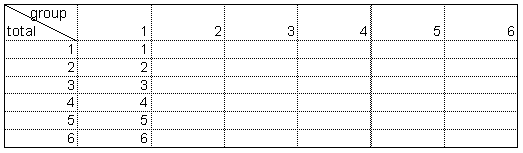
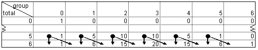
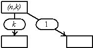
We start by noticing that we can find the answer for a similar, but much simpler problem easily. We know that, given 6 people, there are exactly 6 subgroups of exactly 1 person, and this is more generally true. Given n people, there are exactly n subgroups of exactly 1 person. So let us set up a table collecting our results in Fig. 1
|
|
|
|
|
|
Fig. 1 |
|
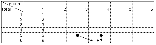
We want to fill the rest of the table. Let us study our prototypical case: 6 people total, subgroups of size 4. We assume that the people are numbered. Now we divide all subgroups of type 4 out of 6 into two separate sets, one set consisting of all groups including person 6, the other one consisting of all groups not containing person 6. The second set is identical with the complete set for the 4 out of 5 problem. The first set can also be characterized easily: just take all groups from the 3 out of 5 problem and add person 6, this produces all 4 out of 6 sets containing person 6. So the solution for the 4 out of 6 problem is the sum of the 4 out of 5 solution and the 3 out of 5 solution; this recursion is to be seen in Fig. 2.
|
|
|
|
|
|
Fig. 2 |
|
This rule applies generally, for every cell starting in column 2 add the number above and the number above and to the left. But we can still refine this structure: We note that each number in the first column is “the number above + 1”, so adding a column 0 with all 1s we can reuse the sum formula for calculating the elements of our table once again. Adding can also add row 0, and thus our table looks like Fig. 3.
|
|
|
|
|
|
Fig. 3 |
|
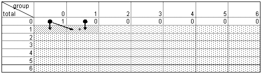
The arrows represent the formulas, and the grey shading indicates that the formulas from the darker cells are copied down and to the right into the lighter cells.
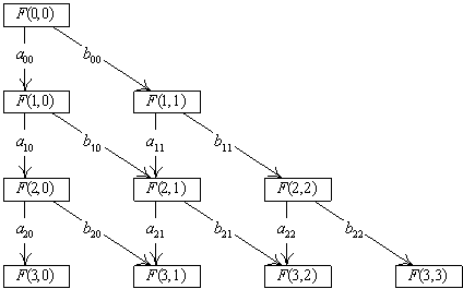
The above graph is equivalent with the following representation:
|
|
|
|
Both representations are equivalent, and anecdotal evidence shows that the graphical representation helps many students to understand the structures easier.
The graphical representation, however, helps gaining more insight.
|
|
|
|
|
|
Fig. 4 |
|
We see that each number migrates down into the next row exactly twice. Consequently, row sums double from row to row. This insight is immediate from the arrow based graphical representation.
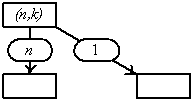
In Neuwirth (2001) we have shown that this graphical model can be extended to cover a much wider range of combinatorics. The following graph is a modified version of the basic recursive structure we discussed above.
|
|
|
|
|
|
Fig. 5 |
|
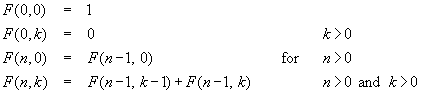
The formula representation of this structure is
|
|
|
|
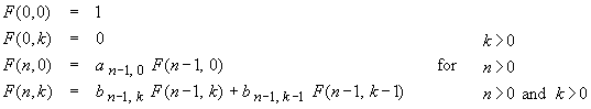
Again, the graphical representation and the algebraic representation are equivalent. Different choices for the “arrow weight functions” yield different combinatorial functions. It is somewhat surprising that binomials, Stirling numbers, Euler numbers, Lah numbers and many more fit into this framework. Additionally, from the graphical representation it is quite clear that the following is true:
If the sum of the vertical weight an,k and the diagonal weight bn,k are constant for all elements of a row, an,k + bn,k = cn , then the row sums are multiplied with the factor cn from one row to the next one.
Therefore, the visual representation gives direct insight into structural properties of combinatorial functions. Using this idea we can represent
|
the binomials as |
the Stirling number of the first kind as |
and the Stirling number of the second kind as |
|
|
|
|
|
Fig. 6 |
Fig. 7 |
Fig. 8 |

2 Difference and differential equations
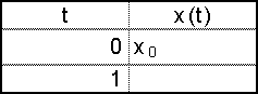
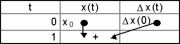
Let us study a simple first order difference equation. In algebraic notation we have a series x(t). In a spreadsheet, it is natural to represent this as a column.
|
|
|
|
|
|
Fig. 9a |
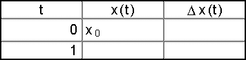
|
x(t) is “constructed” by using Dx(t) = x(t+1)‑x(t), and the basic mechanism of first order difference equations is that we have an equation of the type Dx(t) = f(x(t)). Therefore, we augment our table:
|
|
|
Fig. 9b |
and display the dependency structure
|
|
|
Fig. 9c |
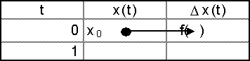
Finally, we visualize the “integration mechanism” x(t+1) = x(t) + Dx(t)
|
|
|
Fig. 9d |
Combining all out graphical representation and using grey shading to indicate copied formulas we arrive at the following graphical representation for solving difference equation.
|
|
|
Fig. 9e |
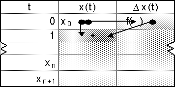
Fig. 9d and e visually separate the difference equation “per se” and the numerical integration method. Looking at these two figures it is quite clear that column 2 implements the integration method and column 3 implements the difference equation. Therefore, changing parameters of the difference equation is accomplished by manipulating the formulas in column 3 only.
Our two examples should have demonstrated that the spreadsheets paradigm helps in building a new, more visually oriented notation for mathematical structures. Especially with non-major students, this might help in accessing mathematical content more easily. More material related to this approach is available from SunSITE Austria, and the forthcoming book by Neuwirth and Arganbright will build a complete course in mathematical modelling mainly on this visual metaphor.
References:
Arganbright, D. (1993) Practical Handbook of Spreadsheet Curves and Geometric Constructions. CRC Press.
Neuwirth, E. (2001) Recursively defined combinatorial functions: Extending Galton's board. Discrete Mathematics, to appear
Neuwirth, E. and Arganbright, D. Spreadsheet Programs as Tools for Mathematical Modeling, in preparation.
SunSITE Austrian Spreadsheet resources, http://sunsite.univie.ac.at/Spreadsite/
Spreadsheets across the curriculum
Robert S. Smith
Ohio, USA
2. Graph transformations with spreadsheets
3. Derivatives and rate of change
4. Approximating zeros of functions
Excel and other such electronic spreadsheet programs have found their way in to a variety of undergraduate mathematics courses. In this paper we will illustrate some spreadsheet uses in several areas of undergraduate mathematics.
1 Introduction
Initially the electronic spreadsheet was used in mathematics teaching to implement algorithms that relied upon iterative procedures (Arganbright 1984, 1985). However, since the early 1990s the spreadsheet has reached far beyond its initial application and has embraced many different areas of the mathematical sciences. This greater utility has come with increased functionality and ease of use. The spreadsheet is now at home in finite mathematics (Comer 1989), precalculus (Sandefur 1992), calculus (Spero 1991, Smith 1992a, b), differential equations (Beare 1997), statistics (Piele 1991), linear algebra (McLaren 1997), abstract algebra (Sjöstrand 1994), and numerical analysis (McLaren 1997), just to name a few. In this note we will illustrate how the spreadsheet can be used in some of these areas.
2 Graph transformations with spreadsheets
A solid foundation in functions is essential to beginning mathematics students. Students need to be able to visualize a graph based upon its formula representation, and conversely. This is especially true in studying graph transformations.
|
|
|
|
|
|
Fig. 1 |
|
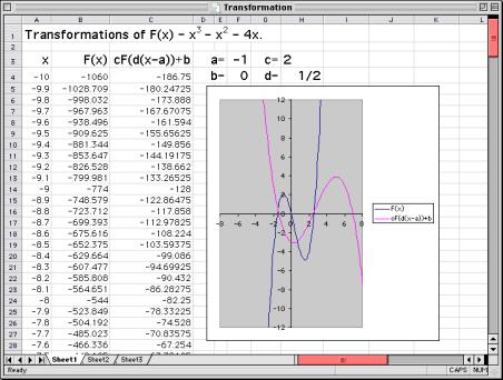
A spreadsheet is a wonderful tool to help students grasp and understand function transformations–horizontal shifts (F(x–a)), vertical shifts (F(x) + b), vertical stretches and compressions (cF(x), c>0), horizontal stretches and compressions (F(dx), d>0), reflections about the x-axis (-F(x)), reflections about the y-axis (F(-x)), and compound transformations (cF(d(x–a)) + b). Instructors are using spreadsheets such as the one above to illustrate these concepts and to provide examples, while students are using spreadsheets for drill, practice, concept reinforcement, and discovery.
3 Derivatives and rate of change
In a casual discussion with a colleague, the question arose as to what knowledge a student should take away from a beginning calculus course. The colleague said that he wanted his students to know how to compute the standard derivatives of the course. From the author’s point of view, this is not enough. Students should know what a derivative is! We would suggest that computation of the standard derivatives should be augmented by computing derivatives from the definition, and by studying the difference quotient function,
![]()
|
|
|
|
|
|
Fig. 2 |
|
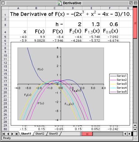
that approximates F´(x). To get a better feeling for the derivative, perhaps calculus students should analyze Fh (x) as h varies. Our sense is that by taking the multi-pronged approach suggested heretofore, students will get a deeper and more balanced view of the derivative of a function. The spreadsheet above can be made dynamic by installing a slider to vary h. Using this slider, students can watch the function Fh (x) converge to F´(x).
Spreadsheets can also be useful in approximating the rate of change in a discrete data set. For example, consider the following problem:
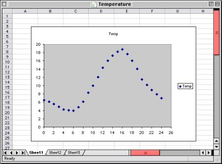
A set of temperatures in degrees Celsius taken hourly from midnight to midnight is given below. Plot the data and approximate the tangent line at 1:00 p.m. as accurately as you can.
|
Hour |
0 |
1 |
2 |
3 |
4 |
5 |
6 |
7 |
8 |
|
Temperature |
6.5 |
6.1 |
5.6 |
4.9 |
4.2 |
4.1 |
4.0 |
4.8 |
6.1 |
|
Hour |
9 |
10 |
11 |
12 |
13 |
14 |
15 |
16 |
|
|
Temperature |
8.3 |
10.0 |
12.1 |
14.3 |
16.0 |
17.3 |
18.2 |
18.8 |
|
|
Hour |
17 |
18 |
19 |
20 |
21 |
22 |
23 |
24 |
|
|
Temperature |
17.6 |
16.0 |
14.1 |
11.5 |
10.2 |
9.0 |
7.9 |
7.0 |
|
It is interesting to see what students will do with such an open-ended problem. Most students would probably make the graph, calculate the slope of the secant line between the data points (12, 14.3) and (14, 17.3), and conclude that the desired slope is approximately 1.5. Hence the tangent line would be y = 1.5x – 3.5.
|
|
|
|
|
|
Fig. 3a |
|
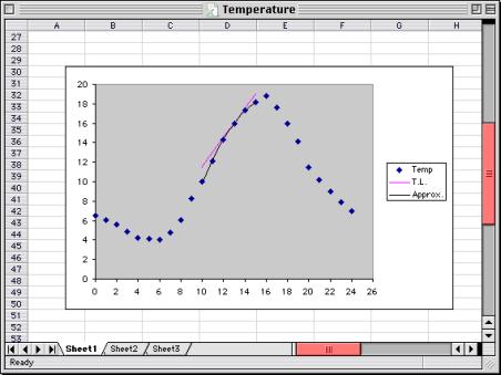
Solutions to this problem are constrained only by the creativity and resourcefulness of the students. A more thoughtful student might construct the parabola that passes through the points (12, 14.3), (13, 16.0), and (14, 17.3), y = .2x2 + 6.7x – 37.3, and compute the tangent line to the parabola at (13, 16.0). While each solution yields the same tangent line, we would certainly want to commend the student who did the parabolic approximation for such an insightful approach.
|
|
|
|
|
|
Fig. 3b |
|
4 Approximating zeros of functions
A natural application of spreadsheets in mathematics is implementing algorithms that rely on iterative procedures. An example of this application is numerically approximating zeros of a function. Finding zeros of functions (or solving equations) is a fundamental application of mathematics that is spread across many disciplines. However, determining a function’s zeros can be a nontrivial activity for students–even if the function is a simple polynomial of degree n > 3. A fortiori, solving an equation such as 2 cos x = 2 – x, can be positively daunting. Yet, the well known Newton-Raphson method will effortlessly find the solutions to this equation and the zeros of a variety of functions. While this method is widely applicable, it is not foolproof and can fail in a spectacular way, as we will demonstrate.
A spreadsheet implementation of the Newton-Raphson method to solve an equation could be as follows:
1 Write the equation in the form f(x) = 0.
2 Make a table of values of the function or a graph of the function so that one can identify an interval over which f(x) has a zero.
3 Select a value, x1, which is close to the zero. This will be the first approximation of a zero of f(x).
4 Compute the second approximation of a zero of f(x), as follows:
![]()
5 Repeat 4 to compute x3, x4, … Use the general iterative scheme to compute
![]()
If the process produces wildly fluctuating iterates, then the process fails. Otherwise successive iterates will tend to stabilize rapidly, in which case a reasonable approximation of the zero will be found.
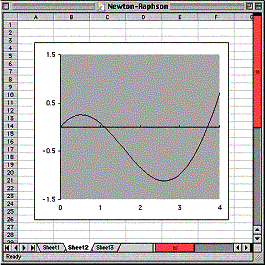
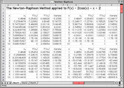
An example
Let us try to approximate the solutions to 2 cos x = 2 – x. First, let us set f(x) = 2 cos x‑2+x. It is clear that there are no zeros of f(x) for x<0 or x>4. A graph of f(x) suggests that zeros can be found in neighborhoods of 0, 1, and 3.5. Indeed, if we take x1 = 0, x1 = 1, or x1 = 3.5 then the algorithm rapidly produces the approximations 0, 1.1091, and 3.6982, respectively. In this example, it is perhaps more interesting to investigate the instability of the method. Since f´(.5) is close to zero, it is reasonable to look for instability in a neighborhood of x = .5. The spreadsheet above illustrates that small changes in x1 can produce radically different results. Indeed, in the interval (0.4845, 0.5001), one can choose x1 so as to find each of the three zeros and also choose a value of x1 so that the Newton-Raphson method diverges.
|
|
|
|
Fig. 4a |
Fig. 4b |
5 Boolean algebra
One day while presenting a seminar on Boolean algebra and switching circuits to some first-year students, the author proved one of the distributive laws for a binary Boolean algebra using a spreadsheet. The students surely doubted the wisdom of this approach. Why would anyone try to invoke the use of a spreadsheet in a Boolean algebra proof? Without stretching the imagination too much, one can see that a spreadsheet approach such as the one below can be applied to any switching function and consequently has immediate application to the design and analysis of switching circuits.
Let us recall that if (B,Ù,Ú,¢) is a Boolean algebra then for all x, y, z Î B, the following distributive laws hold:
xÚ(yÙz) = (xÚy)Ù(xÚz) xÙ(yÚz) = (xÙy) Ú (xÙz)
To prove that the first distributive law holds, all we need to show is that if
f(x, y, z) = xÚ(yÙz) and g(x, y, z) = (xÚy)Ù(xÚz)
then f(x, y, z) = g(x, y, z) for all x, y, z Î {0, 1}. A proof of the distributive law is constructed in the spreadsheet below.
|
|
|
|
|
|
Fig. 5 |
|
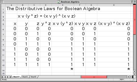
Note that the entries in cells D6 and E6 are “=min(B6, C6)” and “=max(A6, D6),” respectively. The values for f(x, y, z) are found in column E. The entries in cells F6 and G6 are “=max(A6, B6)” and “=max(A6, C6),” respectively. The values for g(x, y, z) are found in column H.
6 Abstract algebra
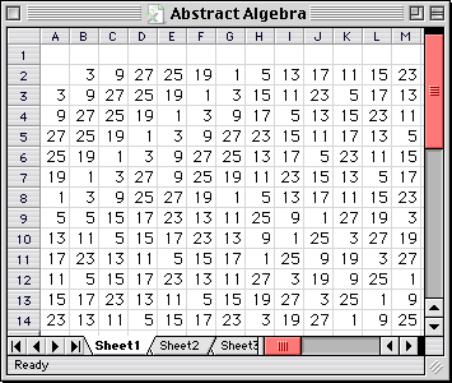
American students often think of abstract algebra as one of the most difficult undergraduate courses in the mathematics curriculum. Among the challenges encountered by these students are the notions of binary operations, semigroups, groups, and subalgebraic structures. One way to make these notions less formidable is to study them using a spreadsheet. Here is an exercise that helps students come to terms with these concepts.
Consider the semigroup (S,·) where S is the set of integers modulo 28 and the binary operation is multiplication modulo 28. Construct the Cayley (multiplication) table for this semigroup. Determine <3>, the subsemigroup of (S,·) generated by 3, and determine <3, 5>, the subsemigroup of (S,·) generated by the subset {3, 5} Is either of these subsemigroups a group?
Building the Cayley table for (S,·) facilitates the construction of <3> or any other subsemigroup. To build the Cayley table for (S,·), enumerate from 0 to 27 down column A beginning in cell A3. Install “=$A3” in cell B3 and copy down to cell B30. Copy B3 through B30, select B2 to AC2, and then implement Edit ® Paste Special ® Transpose ® OK. Now, clear cells B3 to B30. Install “=mod($A3*B$2, 28)” in cell B3 and copy to cell AC30 to complete the table.
To produce a Cayley table for <3>, simply clear column A and place the powers of 3 in column A. Once this Cayley table is constructed, it is a simple matter to augment it to produce the subsemigroup <3, 5>. The student can easily discern that both <3> and <3,5> are groups, and that <3> is a subgroup of <3,5>. This Cayley table can be used to generate all subsemigroups and all groups within (S,·). Such exercises help to reinforce basic algebraic notions such as closure, identity, generators, subgroups, and groups.
|
|
|
|
|
|
Fig. 6 |
|
7 Conclusion
The electronic spreadsheet is an easy to use and versatile pedagogical tool. Many students learn to use spreadsheets in courses outside of mathematics, and this is good career training. However, when students do mathematics with a spreadsheet, they benefit in two ways: they enhance their mathematical experiences and gain a dynamic new perspective on the uses and analytical power of this software tool. With a variety of built-in mathematical and statistical functions and excellent graphics (Arganbright 1993), the spreadsheet is a powerful instrument for teaching and learning in many areas of the mathematical sciences.
References
Arganbright, D. (1984) The electronic spreadsheet and mathematical algorithms. The Coll. Math. J. 15, 148-157.
Arganbright, D. (1993) Spreadsheet Curves and Geometric Constructions. CRC Press.
Arganbright, D. (1985) Mathematical applications of electronic spreadsheets. McGraw-Hill.
Beare, R. (1997) Mathematics in Action. Chartwell-Bratt.
Comer, S. (1989) The use of spreadsheets in finite mathematics. Proc. of Conf. on Technology in Collegiate Mathematics. Addison-Wesley, 129-132.
McLaren, D. (1997) Spreadsheets and Numerical Analysis, Chartwell-Bratt.
Piele, D. (1991) Introductory statistics with spreadsheets. Addison-Wesley.
Sandefur, J. (1992) Technology, linear equations, and buying a car. The Math. Teacher 85, 562-567.
Sjöstrand, D. (1994) Mathematics with Excel. Chartwell-Bratt.
Spero, S. (1991) The Electronic Spreadsheet and Elementary Calculus: Graphing and Numerical Methods. Harper Collins.
Smith, R. (1992) Spreadsheets as a mathematical tool. J. on Excellence in College Teach. 3, 131-148.
Smith, R. (1992) Spreadsheets at Joint Meetings in Baltimore. UME Trends 4, 1-3.